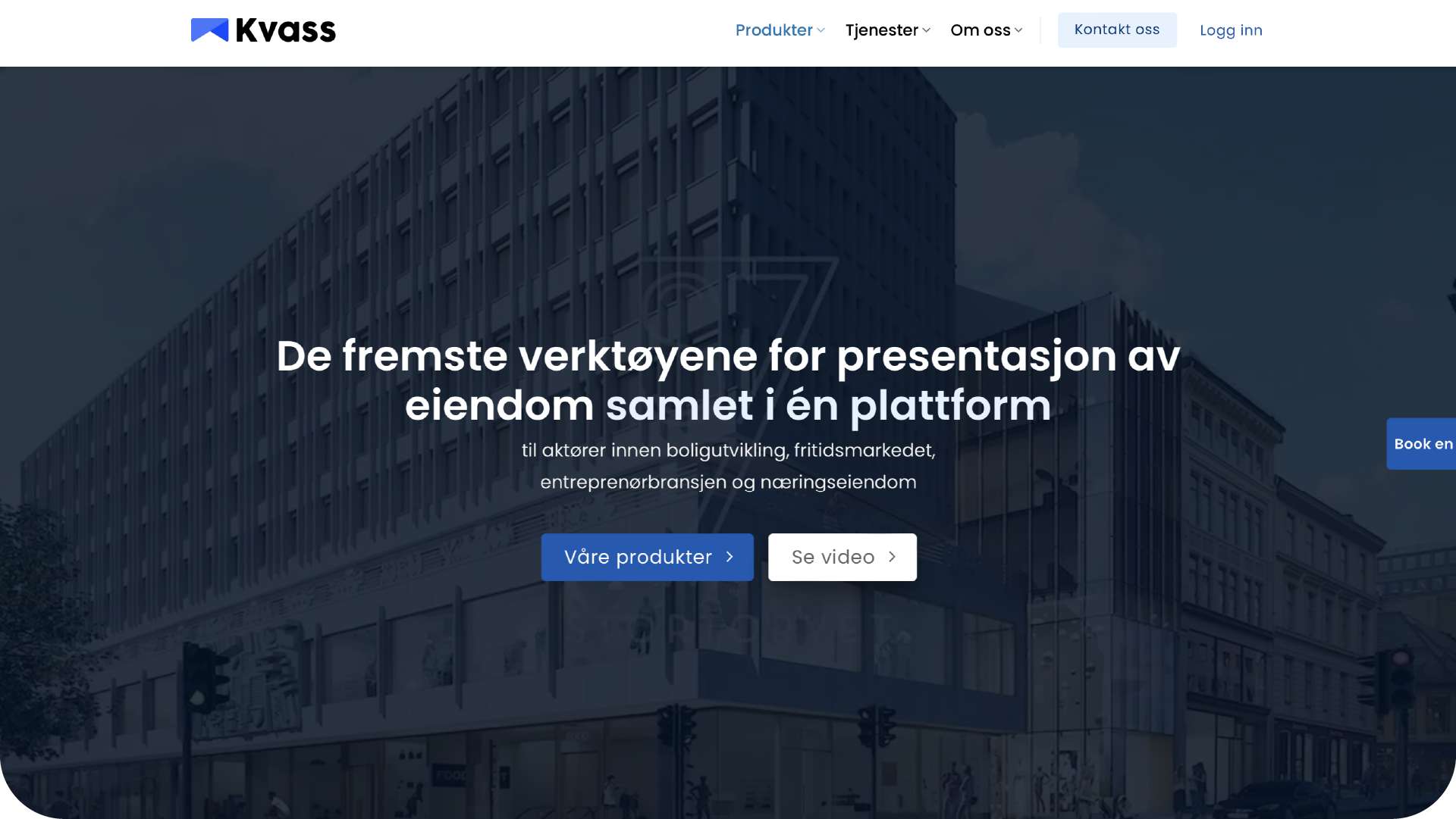
New visual identity and web design for Kvass – a Norwegian software company that delivers a wide range of digital solutions to the real estate industry.
While expanding their company, Kvass were in need of a coherent, new visual identity. Their former branding lacked structure and character. Additionally, Kvass didn't stand out from their competitors with a bland "corporate-safe" blue and white colour palette.
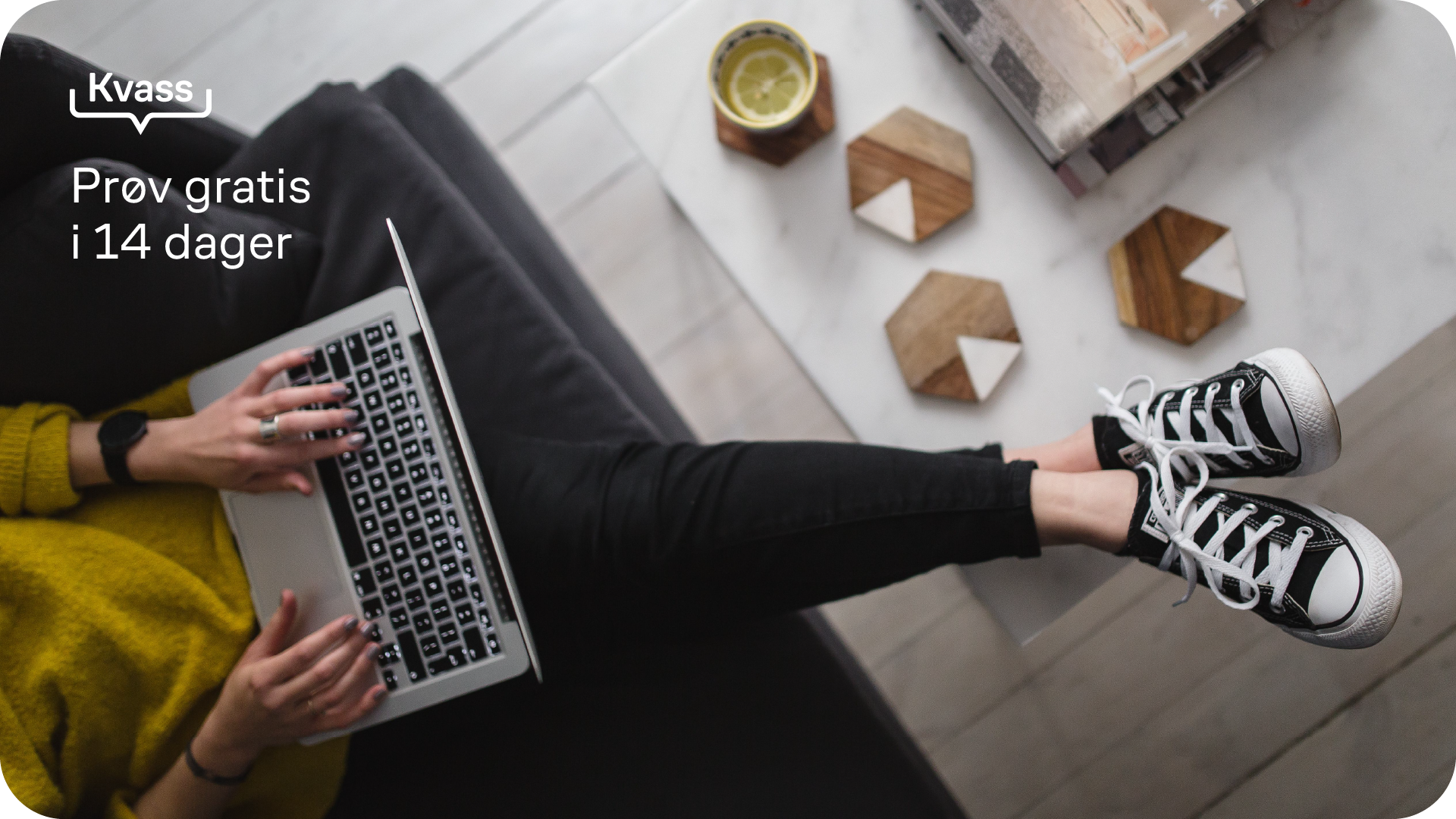
I challenged Kvass with a friendly and colourful approach, while still maintaining a sophisticated business-to-business look.
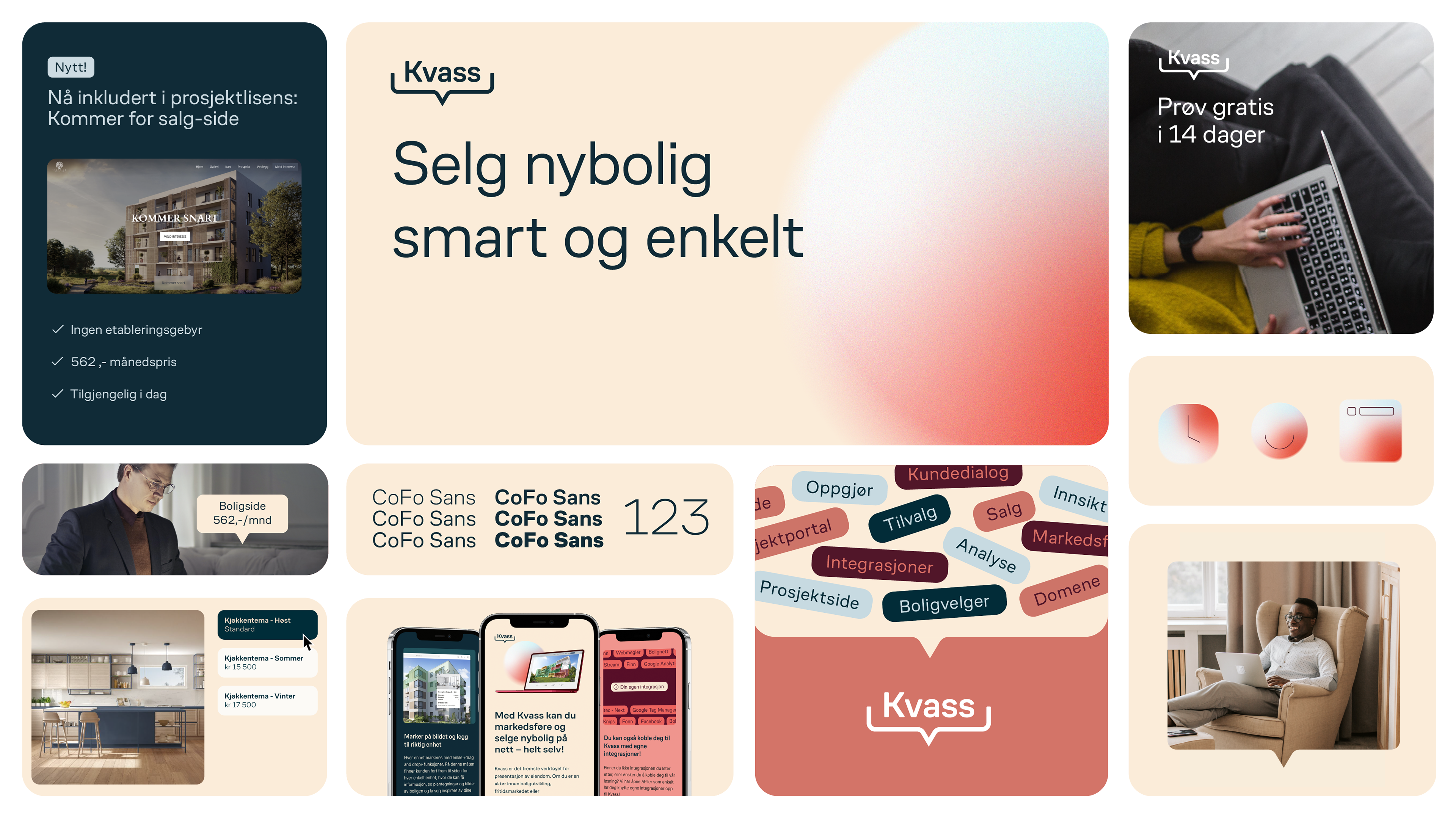
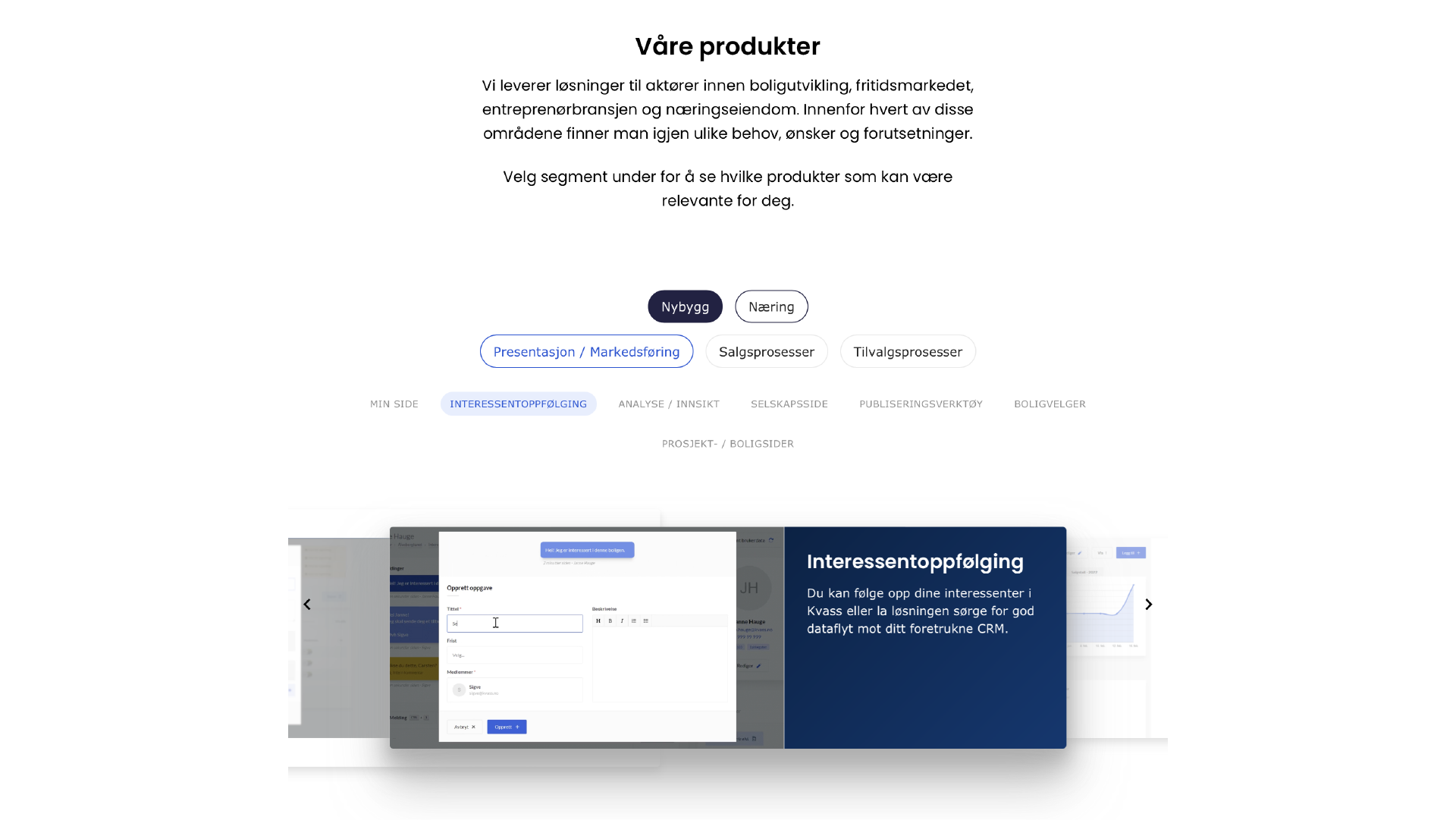
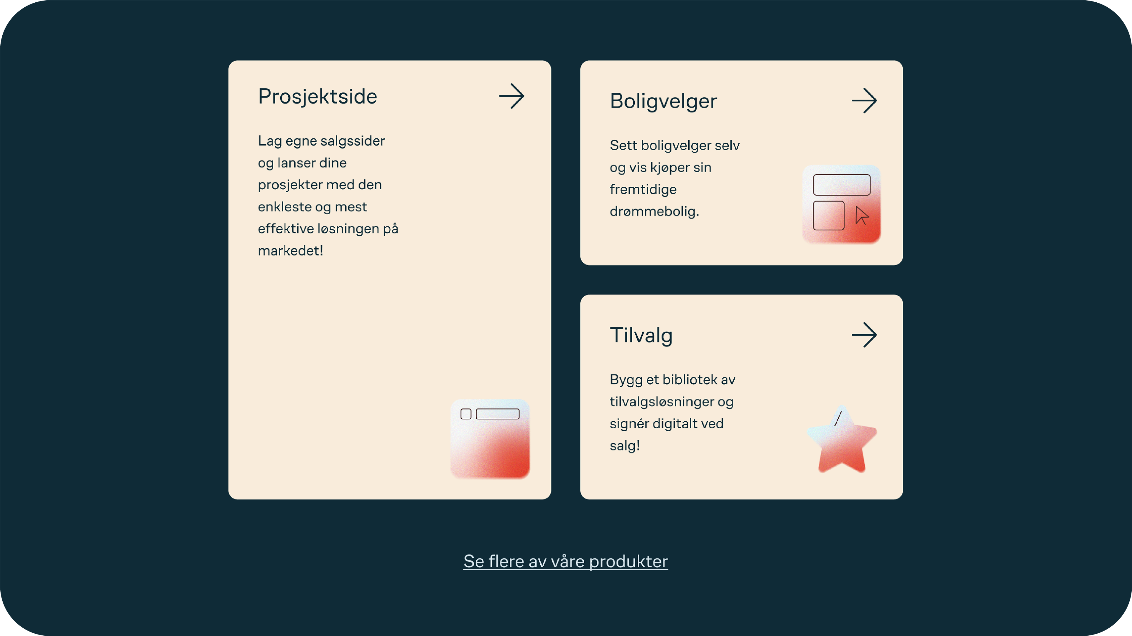
With branding, it's crucial to be recognisable and memorable. Considering Kvass has a wide range of digital solutions, it proved challenging to visualise their entire platform in a simple matter.
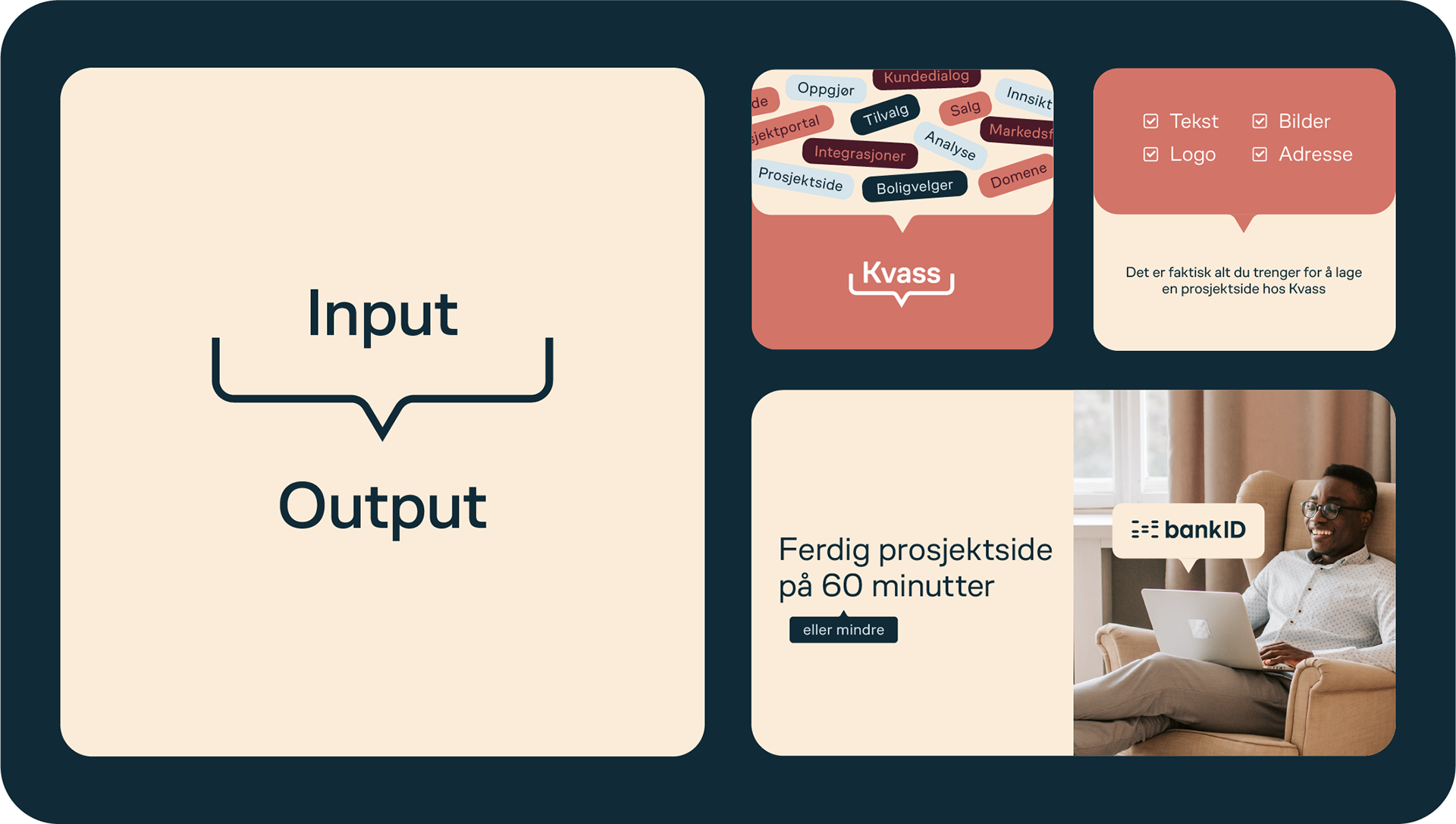
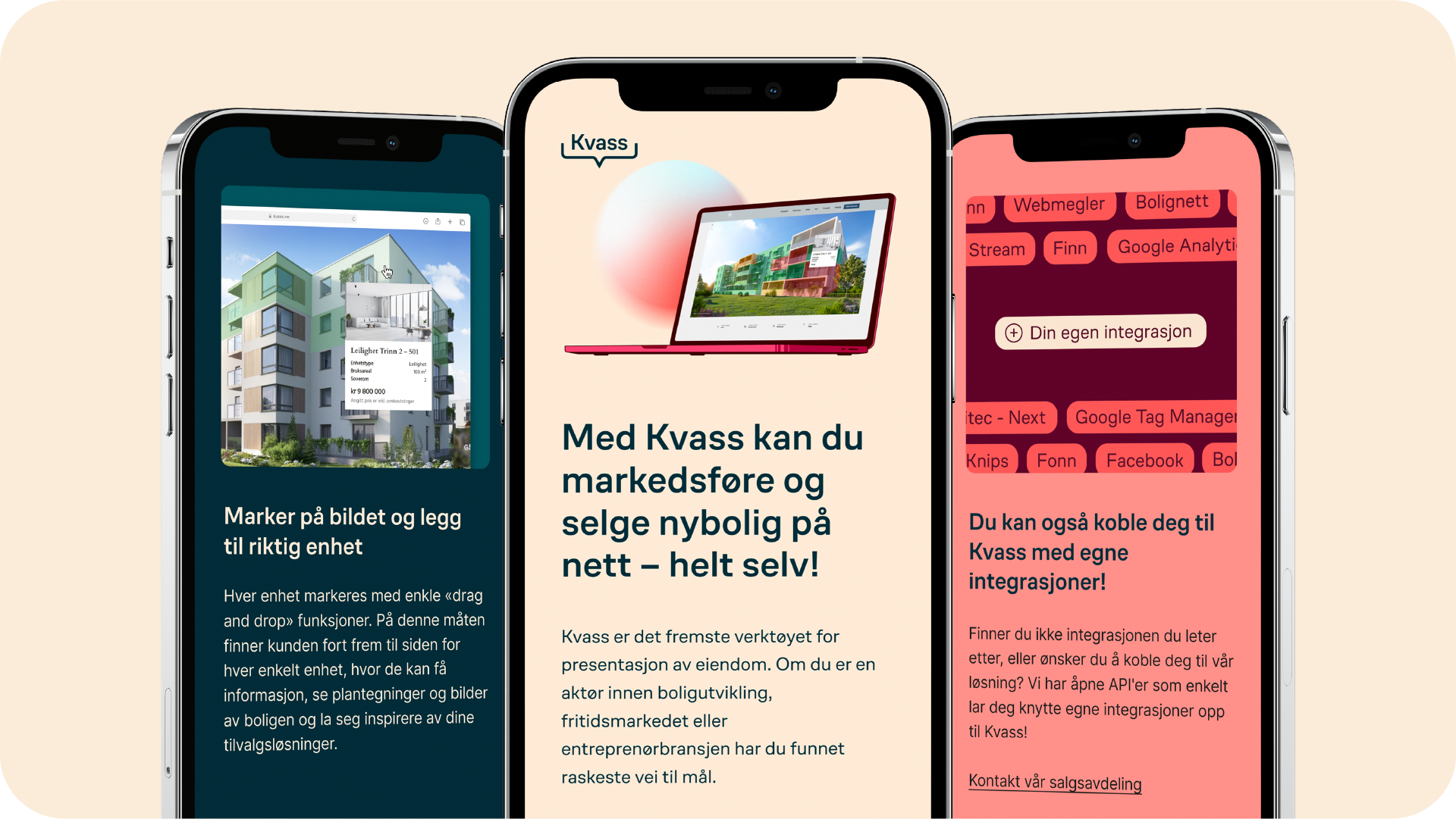
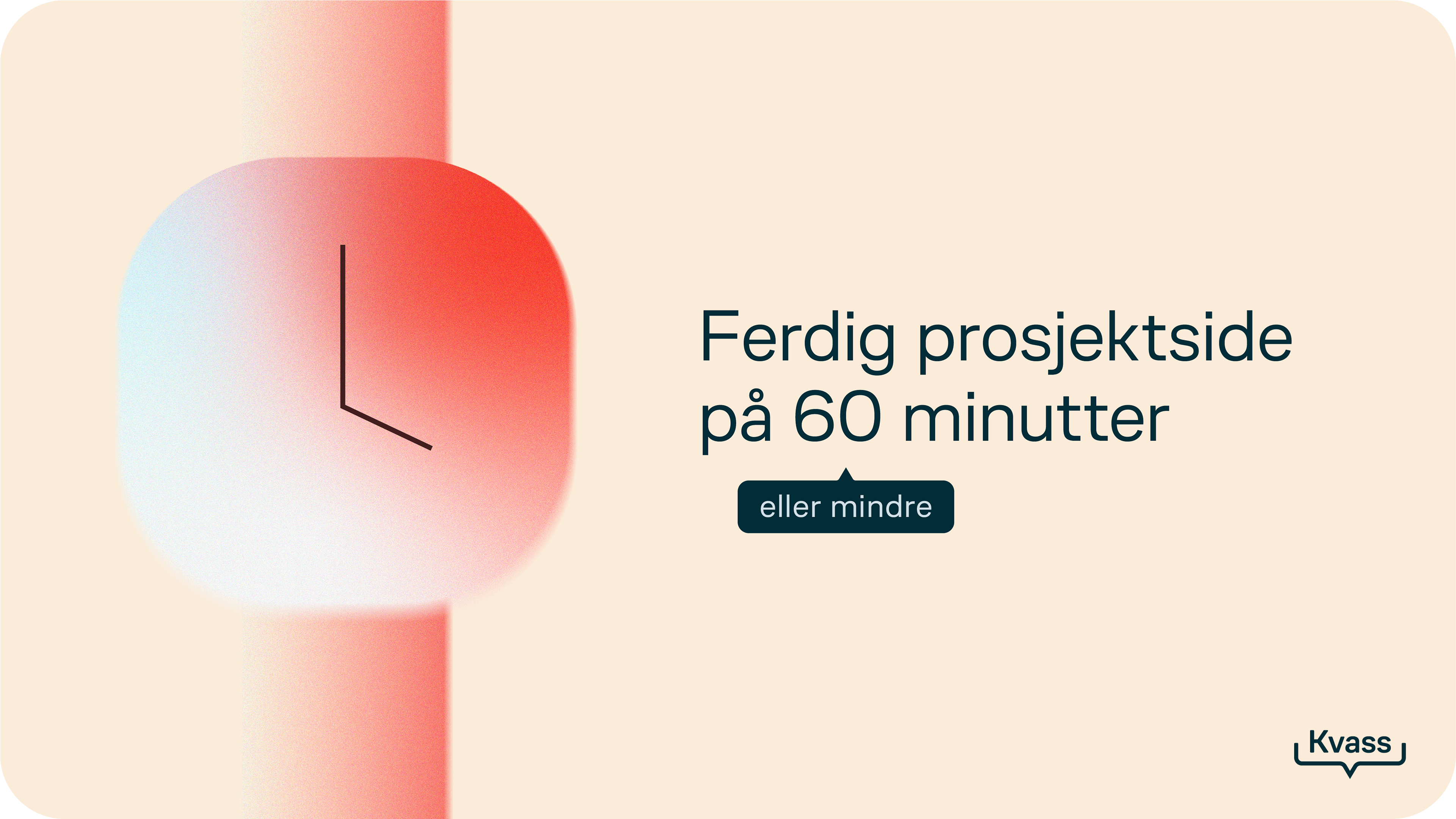
Kvass stands out by consolidating all digital solutions in one place. Additionally, it's super easy to create your own real estate website: Input: Upload text, graphics and photos. Output: A finished website.
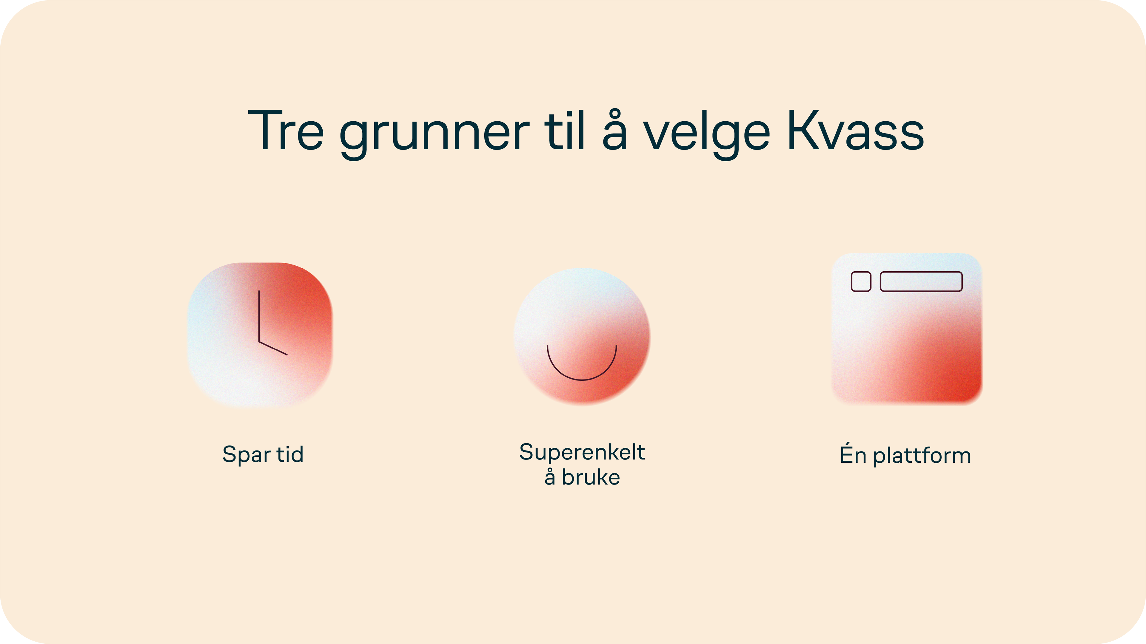
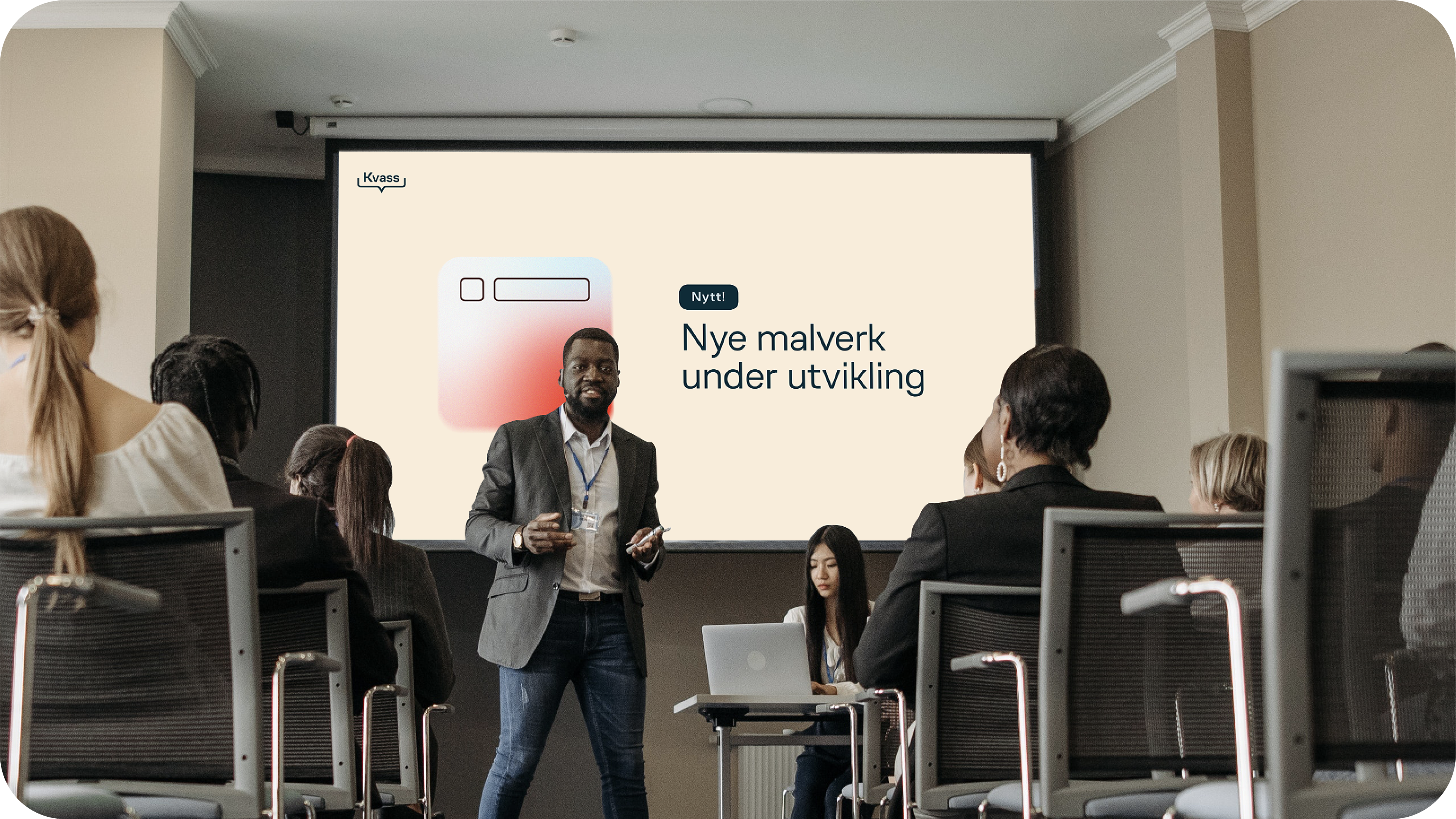
I illustrated both of these core selling points with a funnel icon – a key element in the new visual identity. This versatile icon can visualise their solutions, their easy user experience (input → output) and provide extra information as a speech bubble. But most importantly, it makes Kvass recognisable at a glance, without even seeing the logo first.
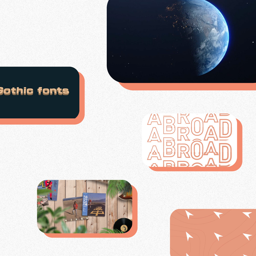
The visual identity is designed in a way to remain creative throughout its lifespan. The profile thus serves as a versatile toolbox. Utilising various graphic elements, a distinctive font and a colorful palette, it's easy to expand the creative Kvass universe.
The new identity is friendly, balanced and at the same time – full of character.
Their old website and visual identity: